Visual Goals
The game uses a stylized visual style with strong shapes and clear silhouettes. Gameplay elements are easy to recognize at a glance, even during intense action. The focus is on clarity and readability, avoiding visual clutter.
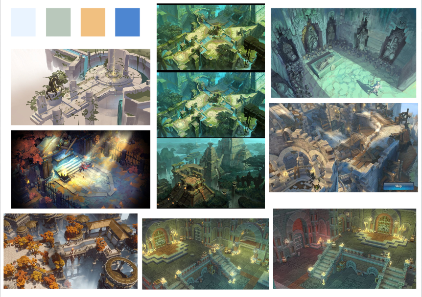
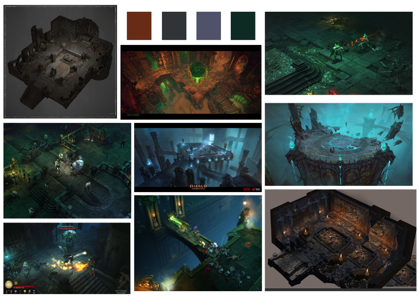
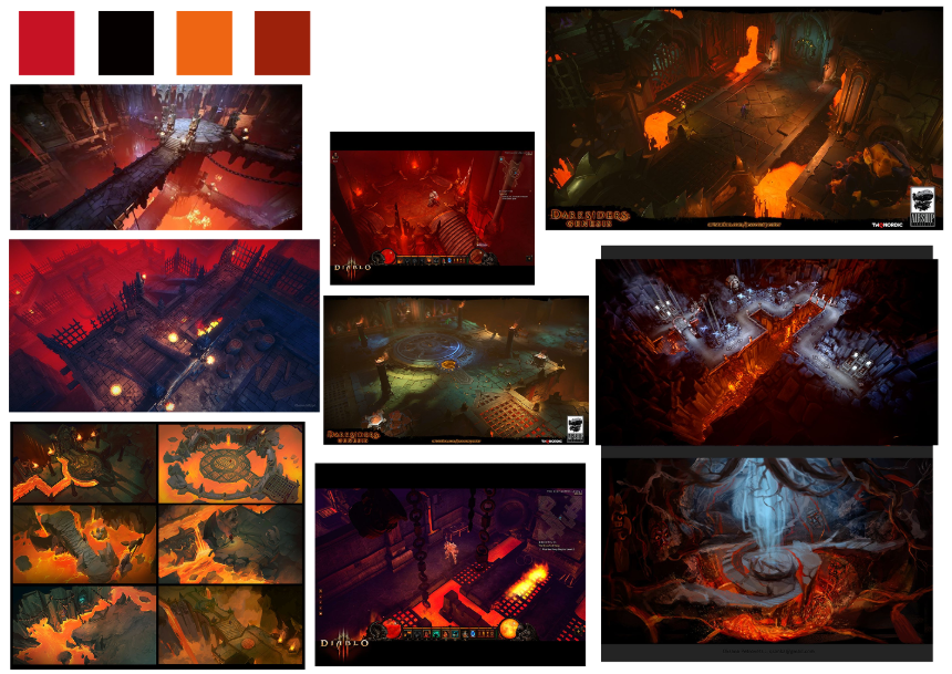
Color supports both mood and gameplay, so it's important to maintain the color scheme consistent thought the game.
- A limited color palette defines the game's identity.
- High contrast separates the player, enemies, interactive objects, and background.
- Lighting is used to highlight important elements and guide attention, not to achieve realism.
- Typography sets the mood of the game, it's important that its readable for the players and also transmits the same energy as the game. For this reason we have chosen Grenze for the overall typeface and Canterbury for the title typeface
The color scheme that we are searching for are warm and neutral colors for the overall game. However, the main characters, main enemies, the bound that pushes Lýriel and Death together and other puntual things have their own color scheme to make it visually easier to identify. As example, the main enemy will have implemented red colors to symbolize danger.
UI color Scheme:

Animation is essential to communication.
- Movements are clear and readable at high speed.
- Motion conveys weight, speed, and danger.
- Visual effects are simple and purposeful, reinforcing actions without overwhelming the screen.
As the game is only around 15 min long is crucial that they understand everything in a first glance. We're searching for a interface easy to understand for the players, for this reason the interface has to be:
- Visually consistent with the game world.
- Provides immediate feedback without breaking immersion.
- Provide all esencial information without interrupting gameplay.
- Responsive UI, to be able to adapt to multiple PC screens
For the gameplay interface we're aiming to have both players, each one in a side of the screen, with their health and abilities in display. The key used to trigger the abilities will be display under them so the users have an easier time remembering them, and in the middle, the bar of their joint skill.

We want to maintain the same visual appearance through the menus.

MAIN MENU

CONTROLS MENU

CREDIT MENU

DEATH MENU
The game avoids:
- Photorealism.
- Excessive detail.
- Effects that reduce readability.
- Inconsistent art styles.
