





Guide users, step by step. A fully customizable, beautiful and easy-to-use stepper widget with different variations.
Easy Stepper guides your users through a flow one step at a time — showing progress or collecting information in clear, organized steps.
 |
 |
 |
 |
In the pubspec.yaml of your flutter project, add the following dependency:
dependencies:
  easy_stepper: <latest_version>
In your library add the following import:
import 'package:easy_stepper/easy_stepper.dart';-
Simply import
package:easy_stepper/easy_stepper.dart. -
Important: The
directionargument controls whether the stepper is displayed horizontally or vertically. A horizontal Stepper can be wrapped within a Column with no issues. However, if wrapped within a row, it must also be wrapped within the built-in Expanded widget. The same applies to the vertical Stepper. -
Validation: To enable validation before the next step is reached, set the
steppingEnabledproperty to an appropriate value in aStatefulWidget. -
Controlling Steppers: All steppers are controlled using the
activeStepproperty. You can control a stepper by tapping individual steps.- See examples here.
-
To customize the color, border, etc., wrap a stepper widget inside a
Containerand specify it'sdecorationargument.
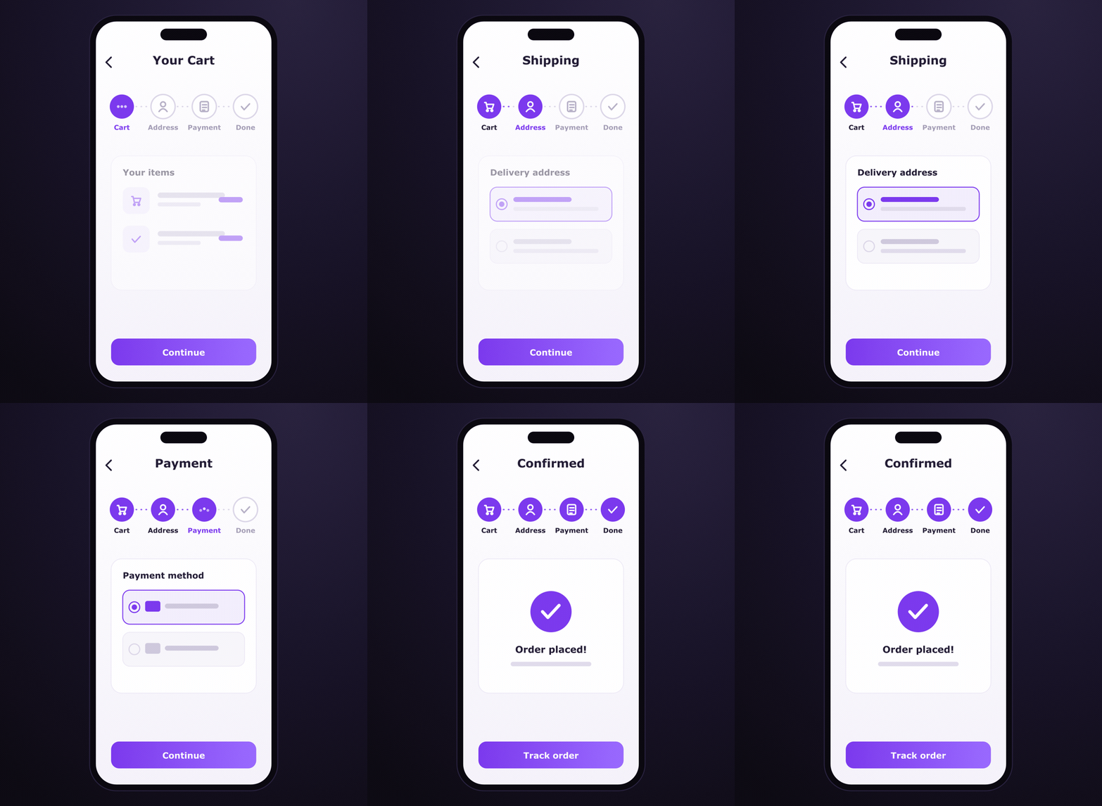
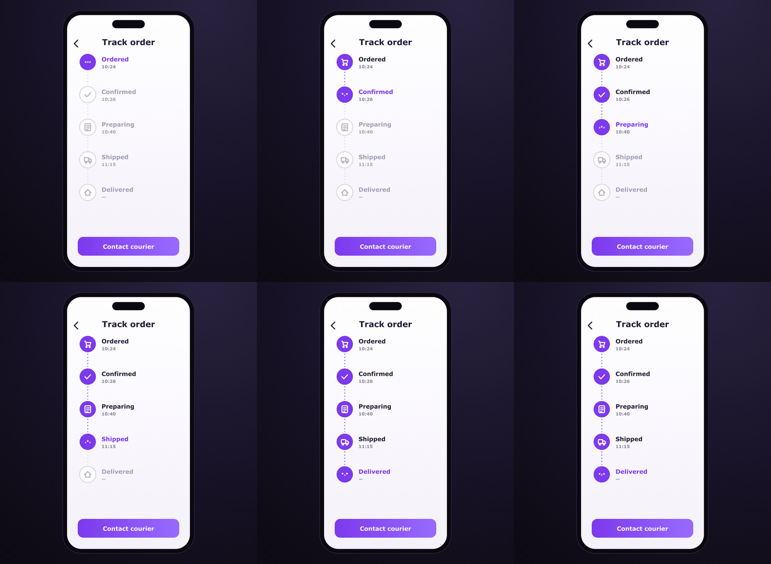
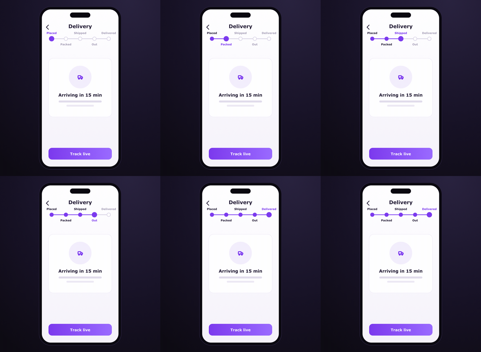
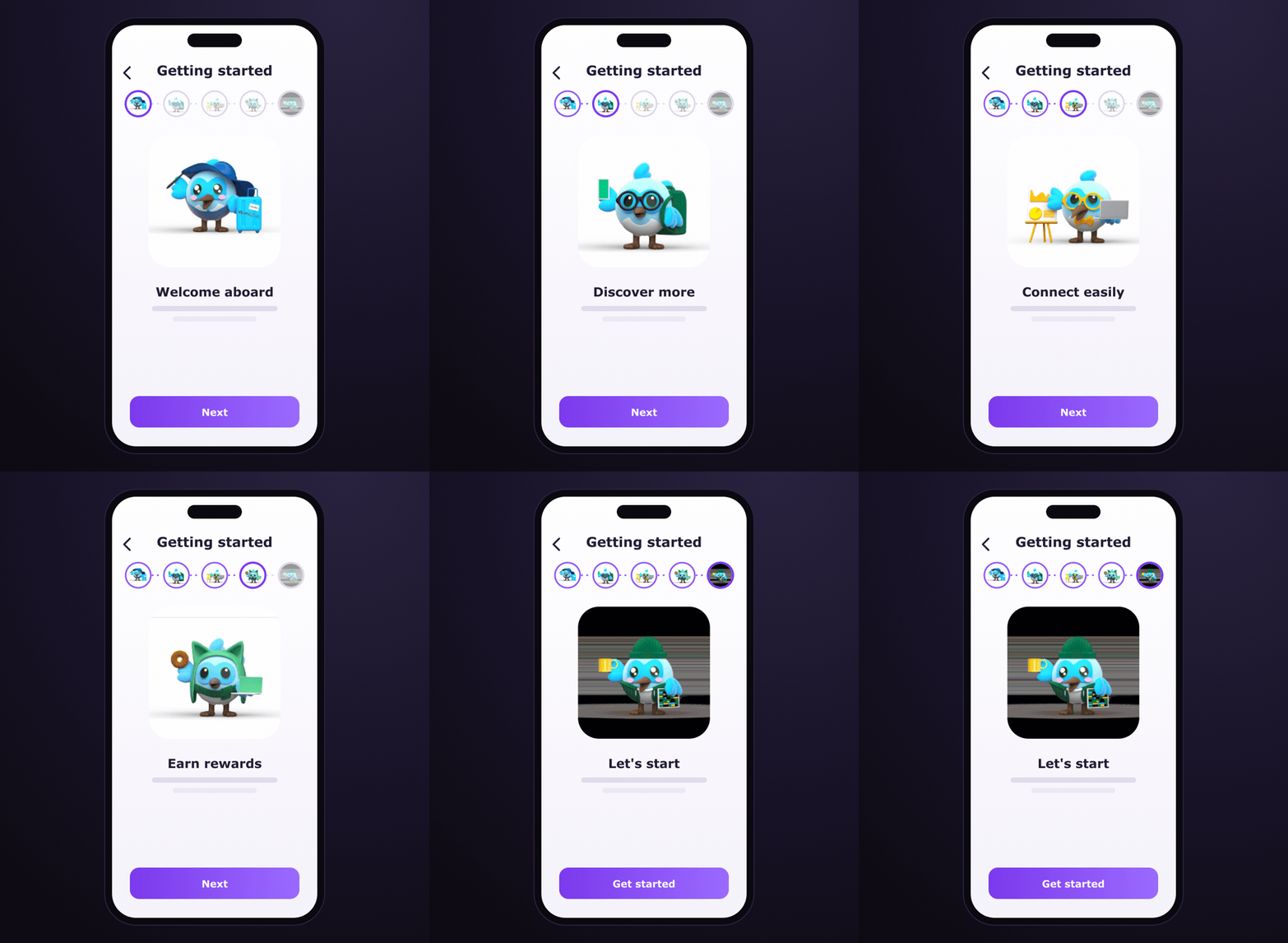
EasyStepper is one widget with many looks. The app mockups above show these types inside real screens — below, each type lists the variations you can produce, with a collapsible code snippet.
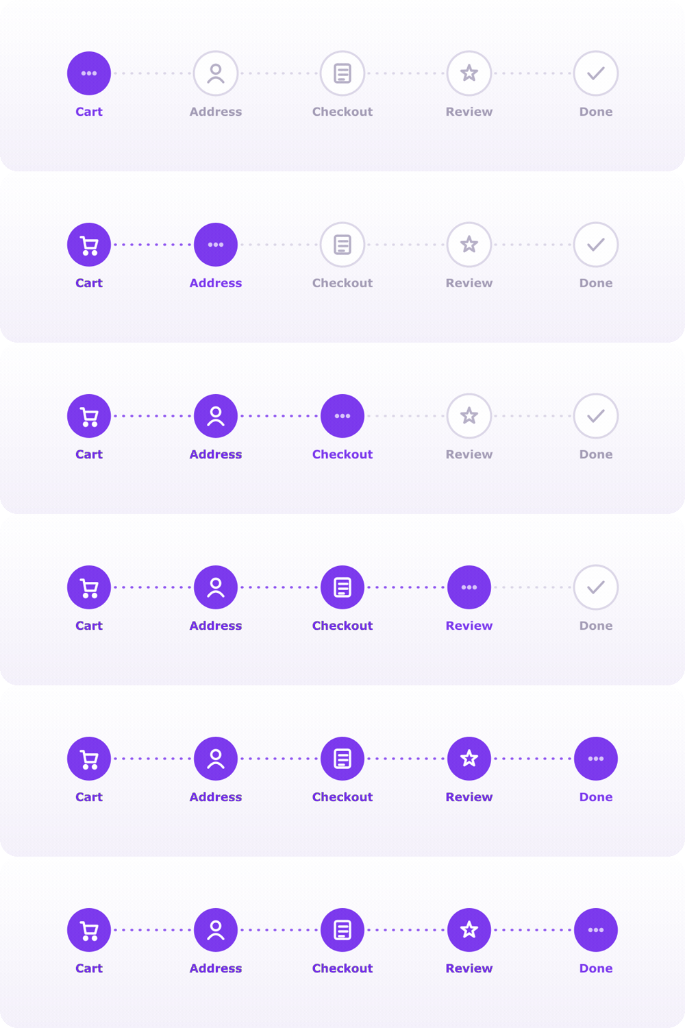
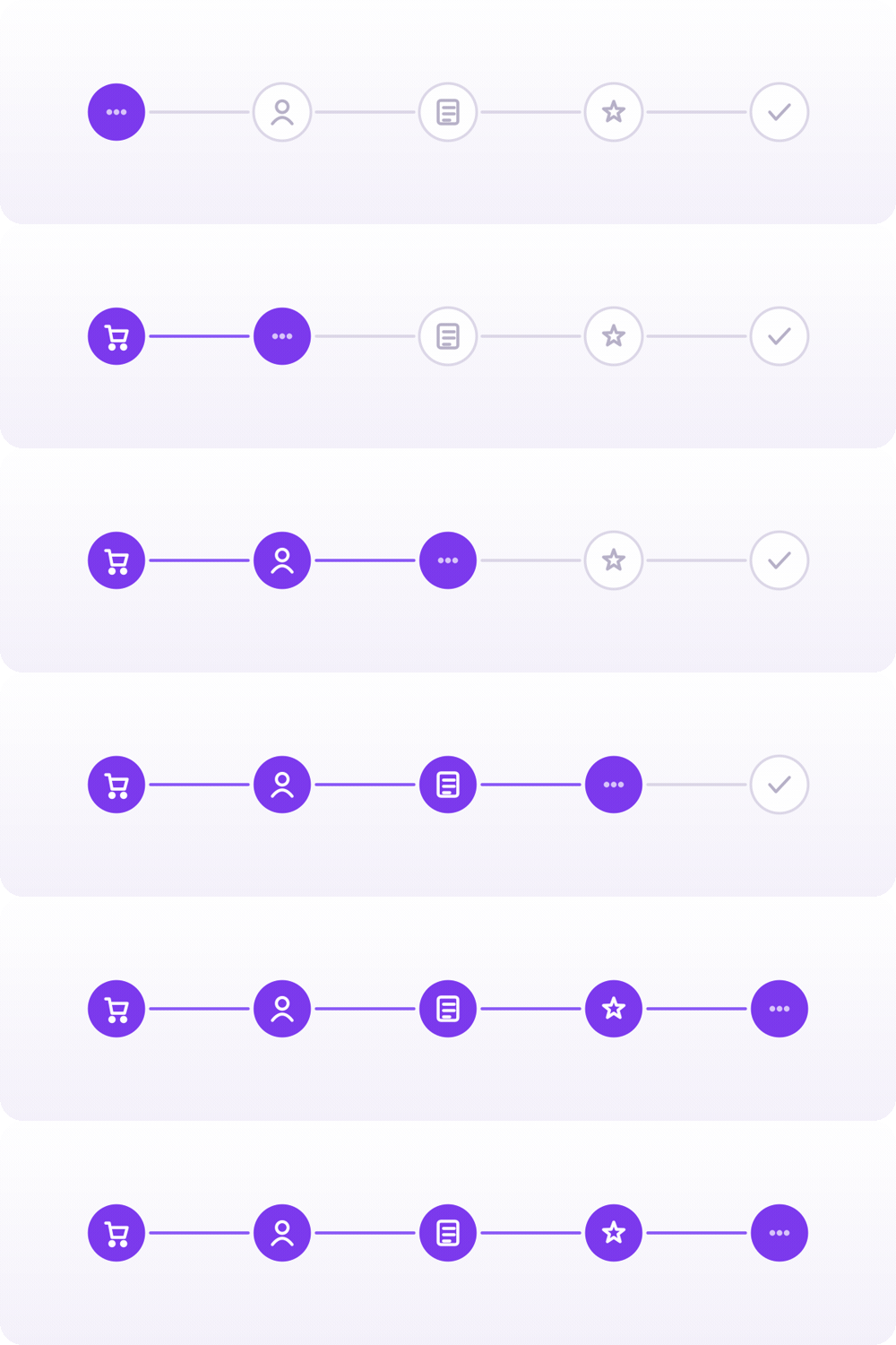
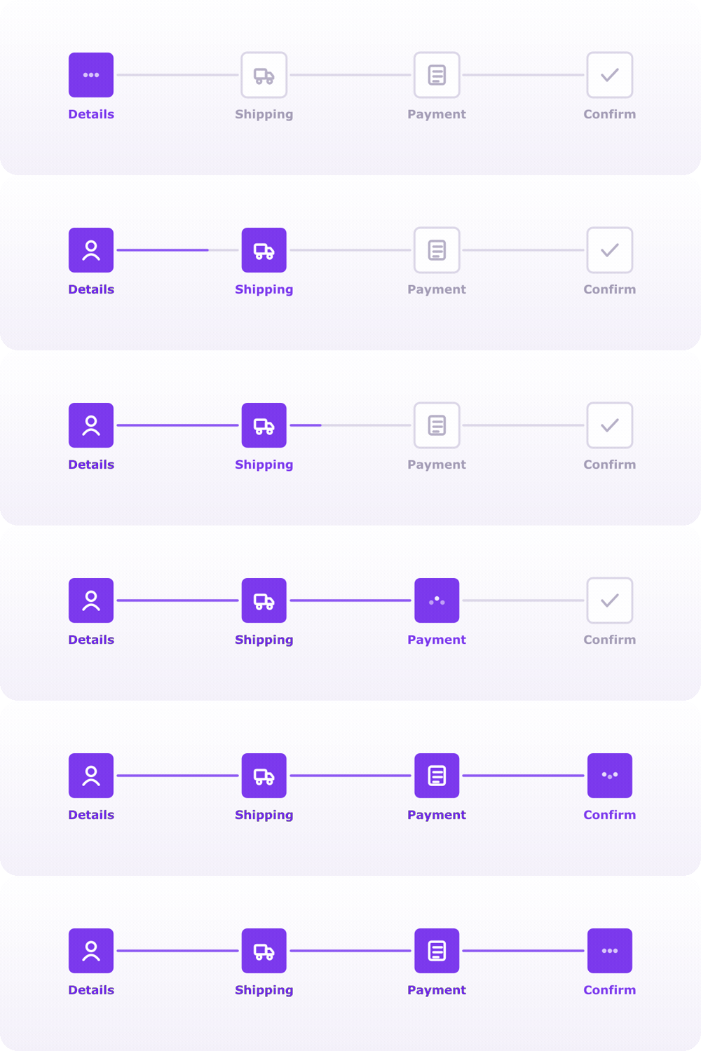
Icons or custom content in a row, with titles above/below/none and dotted or solid connectors — the everyday wizard.
Variations
|
Titles below · dotted |
No titles · solid |
|
Rounded rectangle |
Line text |
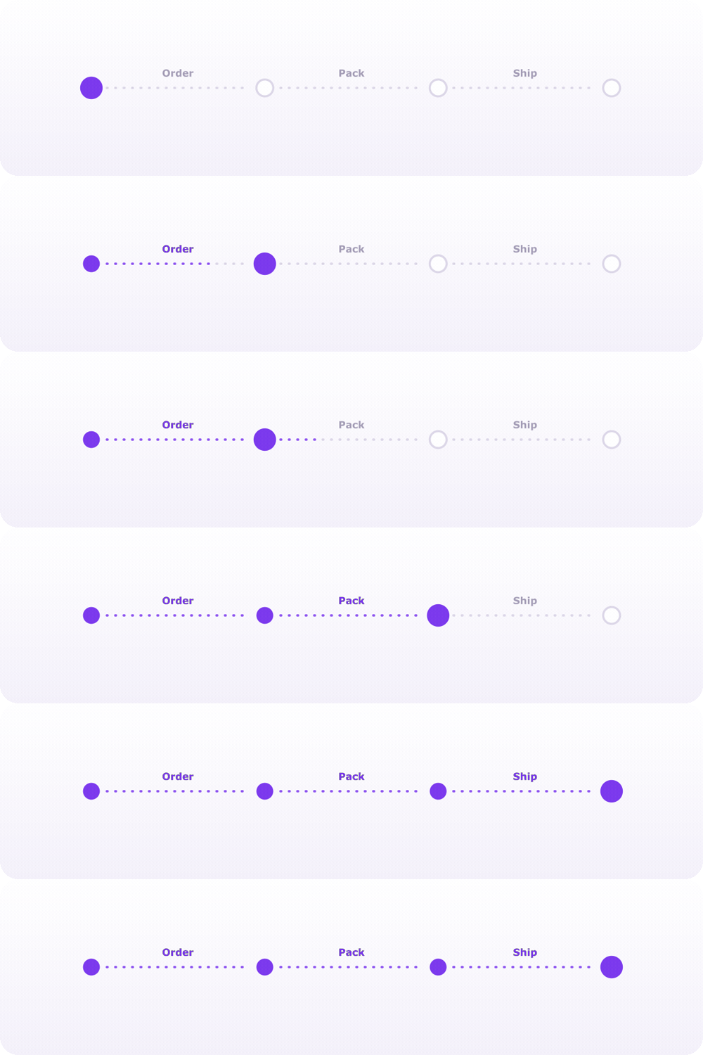
View example code · 25 lines
EasyStepper(
  activeStep: activeStep,
  stepRadius: 28,
  showLoadingAnimation: false,
  stepBorderRadius: 15,
  finishedStepBackgroundColor: const Color(0xFF7C3AED),
  activeStepBackgroundColor: const Color(0xFF7C3AED),
  finishedStepTextColor: const Color(0xFF7C3AED),
  lineStyle: const LineStyle(
    lineLength: 60,
    lineType: LineType.normal,
    lineThickness: 3,
    unreachedLineType: LineType.dashed,
    defaultLineColor: Color(0xFFDCD7E8),
    finishedLineColor: Color(0xFF7C3AED),
  ),
  steps: const [
    EasyStep(icon: Icon(Icons.shopping_cart), title: 'Cart'),
    EasyStep(icon: Icon(Icons.person), title: 'Address'),
    EasyStep(icon: Icon(Icons.receipt_long), title: 'Checkout'),
    EasyStep(icon: Icon(Icons.star), title: 'Review'),
    EasyStep(icon: Icon(Icons.check_circle), title: 'Done'),
  ],
  onStepReached: (index) => setState(() => activeStep = index),
)Set direction: Axis.vertical for timelines and tracking screens.
Variation
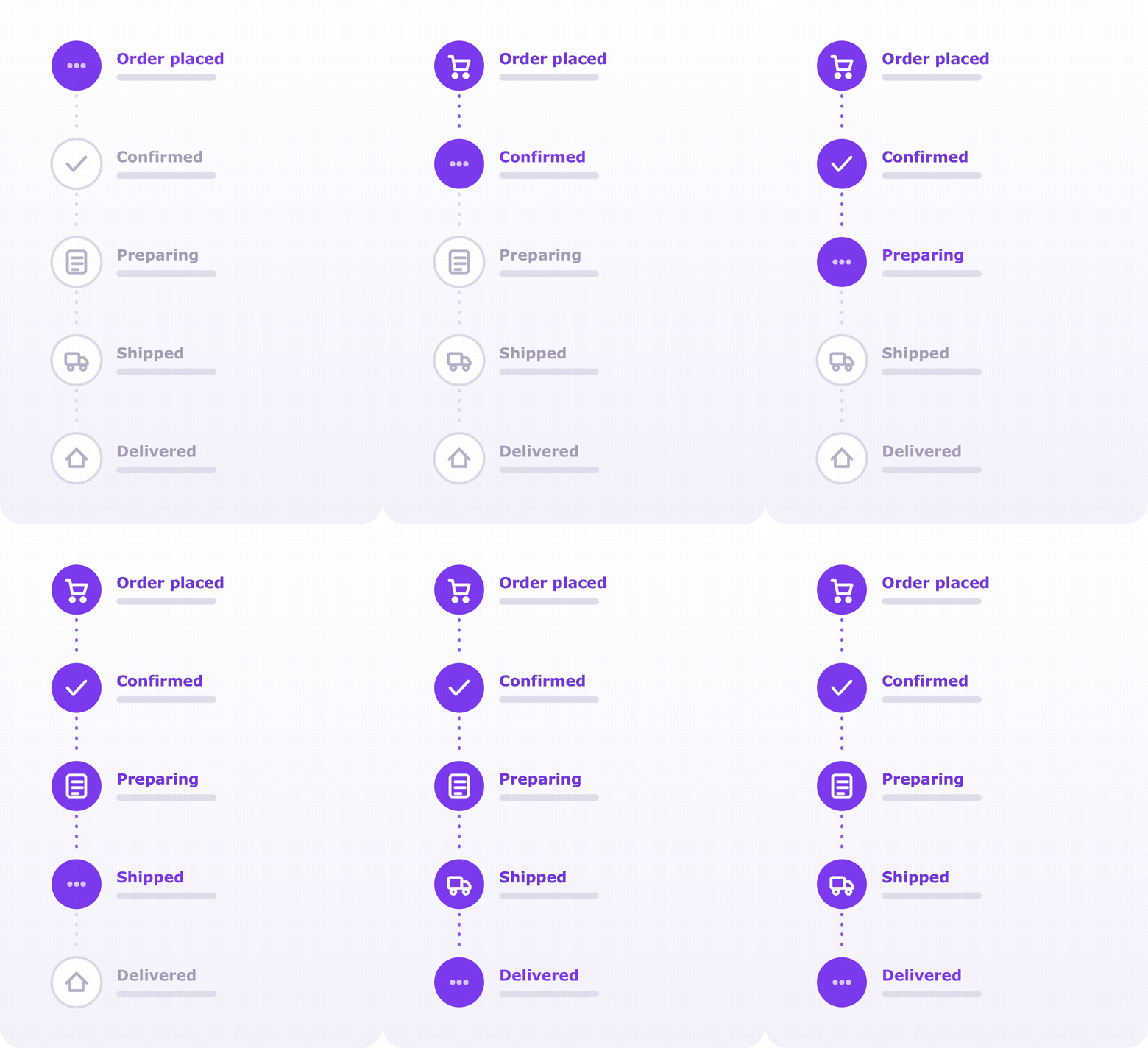
View example code · 20 lines
EasyStepper(
  activeStep: activeStep,
  direction: Axis.vertical,
  showTitle: true,
  stepRadius: 26,
  finishedStepBackgroundColor: const Color(0xFF7C3AED),
  activeStepBackgroundColor: const Color(0xFF7C3AED),
  lineStyle: const LineStyle(
    lineType: LineType.dotted,
    unreachedLineType: LineType.dashed,
  ),
  steps: const [
    EasyStep(icon: Icon(Icons.shopping_cart), title: 'Order placed'),
    EasyStep(icon: Icon(Icons.verified), title: 'Confirmed'),
    EasyStep(icon: Icon(Icons.inventory_2), title: 'Preparing'),
    EasyStep(icon: Icon(Icons.local_shipping), title: 'Shipped'),
    EasyStep(icon: Icon(Icons.home), title: 'Delivered'),
  ],
  onStepReached: (index) => setState(() => activeStep = index),
)For vertical steppers you can control where each step title is rendered using verticalTitlePlacement:
VerticalTitlePlacement.side(default) — title beside the icon (left/right depending on text direction andplaceTitleAtStart).VerticalTitlePlacement.belowIcon— title below the icon.
When using VerticalTitlePlacement.belowIcon, add extra spacing around the connecting line via LineStyle.verticalLinePadding:
EasyStepper(
  direction: Axis.vertical,
  verticalTitlePlacement: VerticalTitlePlacement.belowIcon,
  lineStyle: const LineStyle(
    verticalLinePadding: EdgeInsets.symmetric(vertical: 8),
  ),
  // ...
)Use verticalAlignment to align the steps to the leading edge, center, or
trailing edge of a vertical stepper (defaults to centered):
EasyStepper(
  direction: Axis.vertical,
  verticalAlignment: CrossAxisAlignment.start, // .center (default) / .end
  // ...
)Minimal dots with titles alternating above and below the line — great for compact status bars.
Variation
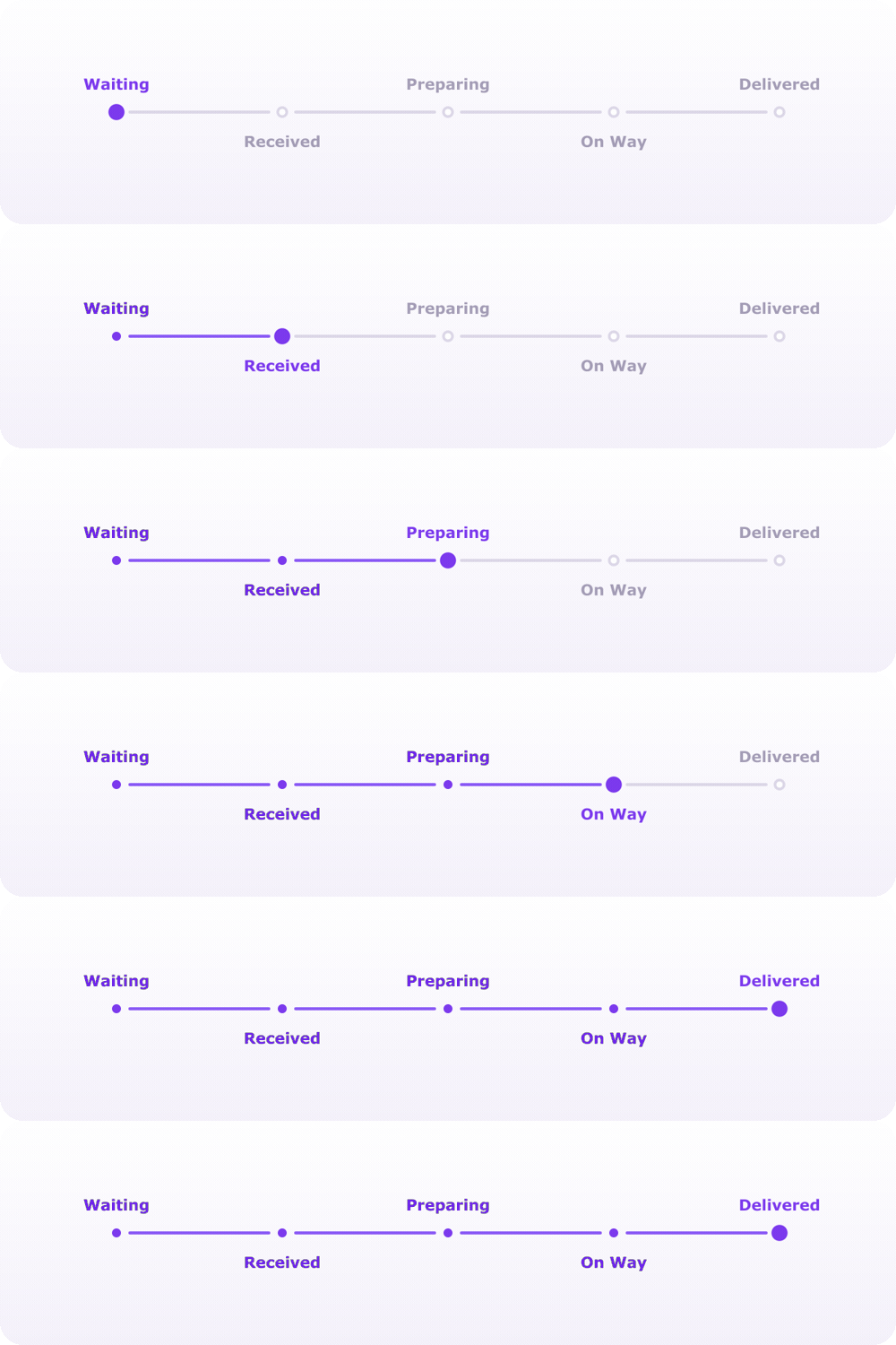
View example code · 31 lines
EasyStepper(
  activeStep: activeStep,
  stepRadius: 8,
  showStepBorder: false,
  showLoadingAnimation: false,
  titlesAreLargerThanSteps: true,
  lineStyle: const LineStyle(
    lineLength: 70,
    lineType: LineType.normal,
    finishedLineColor: Color(0xFF7C3AED),
  ),
  steps: [
    EasyStep(
      customStep: CircleAvatar(
        radius: 8,
        backgroundColor: activeStep >= 0 ? violet : grey,
      ),
      title: 'Waiting',
    ),
    EasyStep(
      customStep: CircleAvatar(
        radius: 8,
        backgroundColor: activeStep >= 1 ? violet : grey,
      ),
      title: 'Received',
      placeTitleAtStart: true,
    ),
    // ...remaining steps
  ],
  onStepReached: (index) => setState(() => activeStep = index),
)Any widget can be a step via customStep — here, images make an onboarding flow.
Variation
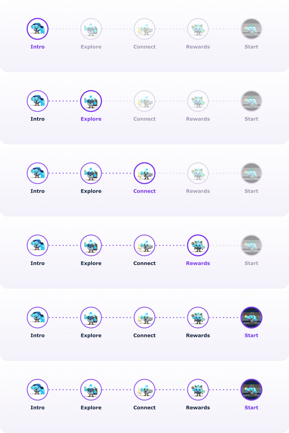
View example code · 28 lines
EasyStepper(
  activeStep: activeStep,
  stepShape: StepShape.rRectangle,
  stepBorderRadius: 15,
  stepRadius: 28,
  borderThickness: 2,
  finishedStepBackgroundColor: const Color(0xFF7C3AED),
  activeStepIconColor: const Color(0xFF7C3AED),
  lineStyle: const LineStyle(
    lineLength: 50,
    lineType: LineType.normal,
    unreachedLineType: LineType.dashed,
  ),
  steps: [
    for (int i = 0; i < 5; i++)
      EasyStep(
        customStep: ClipRRect(
          borderRadius: BorderRadius.circular(15),
          child: Opacity(
            opacity: activeStep >= i ? 1 : 0.3,
            child: Image.asset('assets/${i + 1}.png'),
          ),
        ),
        customTitle: Text('Dash ${i + 1}', textAlign: TextAlign.center),
      ),
  ],
  onStepReached: (index) => setState(() => activeStep = index),
)Feel free to contribute to this project.
If you find a bug or want a feature, but don't know how to fix/implement it, please fill an issue.
If you fixed a bug or implemented a feature, please send a pull request.
Made with contrib.rocks.


-
Please Like to support!
-