


A lightweight, production-ready Flutter package for interactive onboarding walkthroughs. Highlight any widget with a blurred spotlight overlay, adaptive tooltip positioning, and multi-step navigation — with zero third-party runtime dependencies.
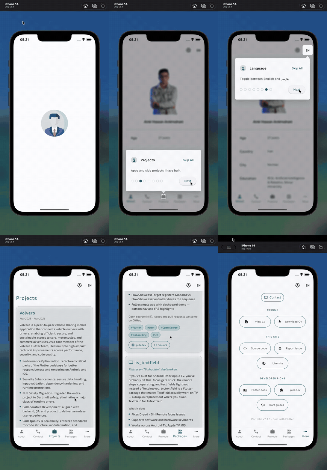
- Declarative targets — wrap widgets once with
FlowShowcaseTargetand start tours by id - Multi-step flows — sequential walkthroughs with skip, next, and dot navigation
- Adaptive layout — tooltip and arrow flip above/below targets; responsive on mobile
- Performance focused — no external packages, single animation controller per step, minimal rebuilds
- Customizable — colors, blur, timing, copy, and dimensions via
FlowShowcaseStyle - Memory safe — registry cleanup on dispose, overlay removal on skip/complete
Add flow_showcase to your pubspec.yaml:
dependencies:
  flow_showcase: ^1.0.0
Then run:
flutter pub getImport the library:
import 'package:flow_showcase/flow_showcase.dart';- Wrap UI elements you want to highlight:
FlowShowcaseTarget(
  id: 'profile_button',
  title: 'Your Profile',
  content: 'Manage your avatar and account settings here.',
  child: IconButton(
    icon: const Icon(Icons.person),
    onPressed: () {},
  ),
),- Start the walkthrough after the first frame (so targets are registered):
@override
void initState() {
  super.initState();
  WidgetsBinding.instance.addPostFrameCallback((_) {
    FlowShowcaseController.start(
      context,
      ids: ['profile_button'],
      onComplete: () => debugPrint('Tour finished'),
    );
  });
}Define targets with unique ids, then pass them in order:
FlowShowcaseController.start(
  context,
  ids: ['nav_home', 'nav_search', 'fab_compose'],
  onComplete: () => _markOnboardingComplete(),
  style: const FlowShowcaseStyle(
    nextButtonLabel: 'Continue',
    fadeDuration: Duration(milliseconds: 280),
  ),
);
Keep a reference if you need to cancel programmatically:
late FlowShowcaseController _tour;

_tour = FlowShowcaseController.start(context, ids: ids);
// later
_tour.skip();FlowShowcaseStyle controls overlay appearance and copy:
| Property | Default | Description |
|---|---|---|
overlayColor |
0x4D000000 |
Dimmed backdrop |
blurSigma |
3.9 |
Backdrop blur strength |
tooltipWidth |
400 |
Desktop tooltip width |
fadeDuration |
350ms |
Entry animation |
nextButtonLabel |
Next |
Primary button (last step shows Done) |
skipButtonLabel |
Skip All |
Multi-step skip action |
See the example/ directory for a full dashboard demo with bottom navigation and FAB highlights.
Run it locally:
cd example
flutter runflowchart LR
A[FlowShowcaseTarget] -->|registers GlobalKey| B[Registry]
C[FlowShowcaseController.start] -->|resolve ids| B
C --> D[OverlayEntry]
D --> E[FlowShowcaseOverlay]
E --> F[Spotlight + Tooltip]
Each FlowShowcaseTarget registers its GlobalKey in a static map while mounted. The controller resolves ids to steps, inserts one overlay entry per step, and removes it before advancing — keeping memory usage flat during long tours.
| Type | Purpose |
|---|---|
FlowShowcaseTarget |
Wraps a widget and registers it by id |
FlowShowcaseController |
Drives the overlay sequence |
FlowShowcaseStep |
Step model (key, title, content) |
FlowShowcaseStyle |
Visual and behavioral configuration |
Issues and pull requests are welcome on GitHub.
This project is licensed under the MIT License — see the LICENSE file for details.