This analysis reviews data from Citi bike business in New York City. The data was collected during August 2019 to represent a period where peak use could be observed. Using pandas to convert time stamps into usable formats, the data was loaded into Tableau to create visualizations. These visualizations will help illustrate the feasibility, or lack thereof, for placement of a Citi bike business in De Moines, IA. Though the data may be compelling for the success of this type of business, it is important to remember that New York City is quite different from De Moines, IA. Additional data must be analyzed prior to finalizing a decision.
Pandas Tableau Public (https://public.tableau.com/app/profile/andrew5897/viz/NYC_CitiBike_16236268354810/NYCCitibikeAnalysis)
The visualizations in this analysis focus usage of the service by date, time, duration, gender, and customer type.
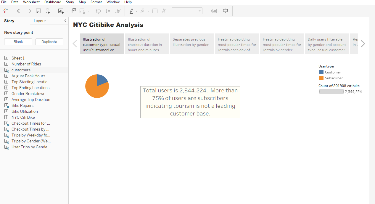
Customers
This visualization is a chart that shows the number of customers and the number of subscribers. More than 75% of people that use the service are subscribers. This indicates that tourists are not a significant portion of the revenue generated from the service, despite the large amount of tourism in New York City.
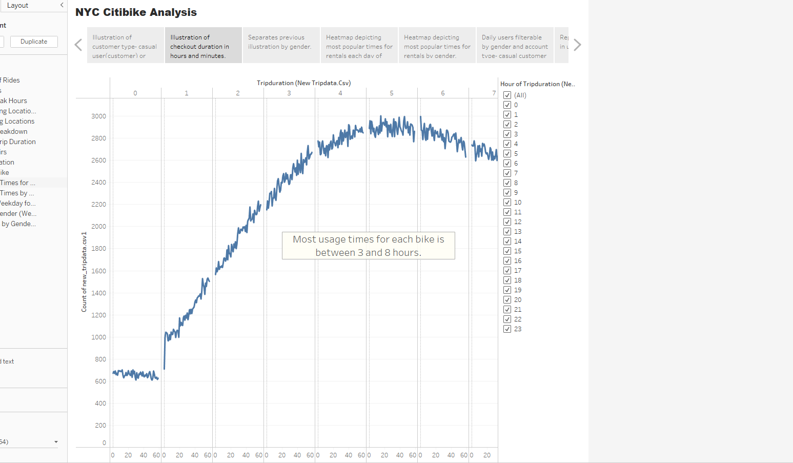
This visualization shows the duration of use by customers. The conclusions that can be drawn are the most common duration of the use. Knowing how long bikes are used helps to determine how long bikes sit at a rental station, or if rental stations are empty, resulting in lost usage by customers. Most durations range in the 3 to 8 hours of use.
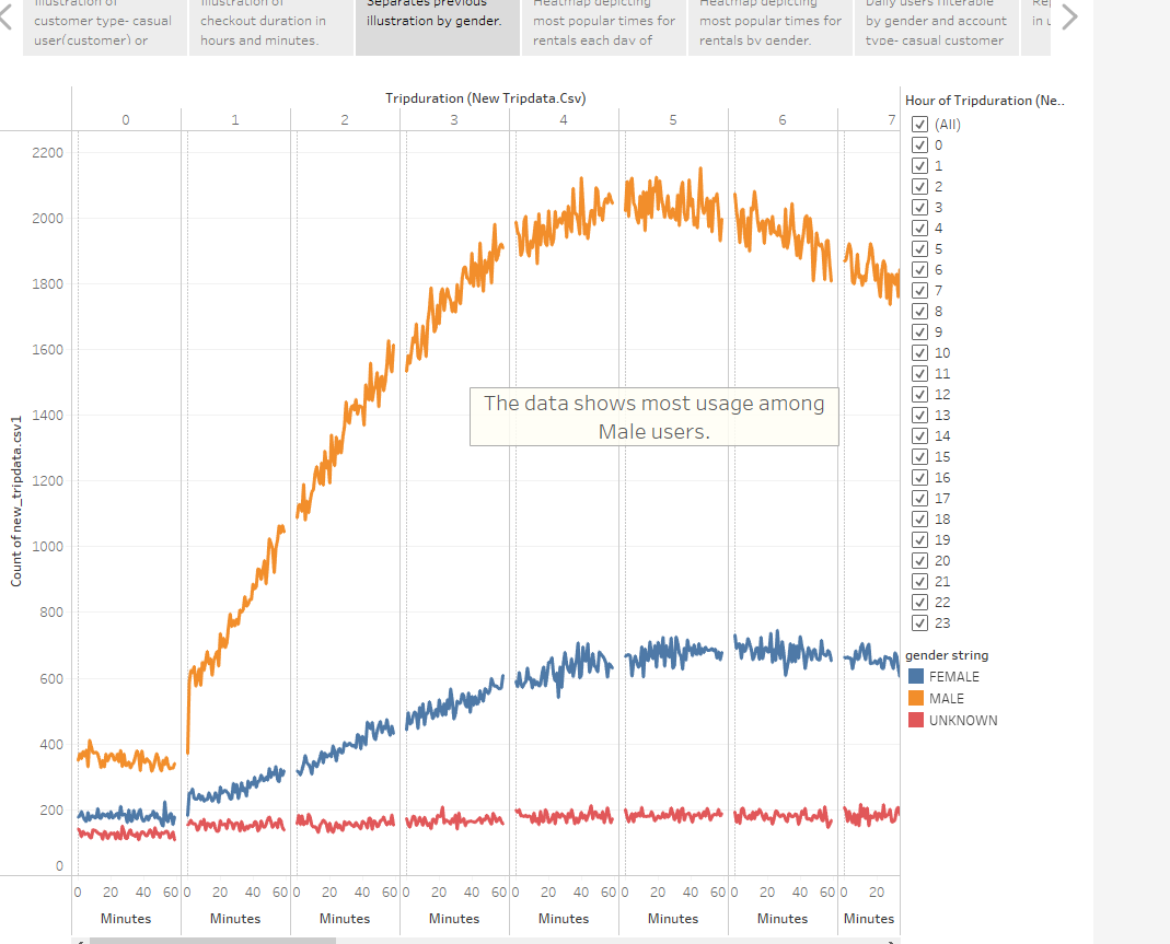
This visualization shows the same information as Checkout Times for Users and separates the data by gender. Knowing the gender shows which gender uses the bike service, when they use it, and for how long the bike is in use. Males use the bikes much more often than females. However, the usage times and duration are similar. Females use the bikes for longer periods of time, from 4 to 9 hours.
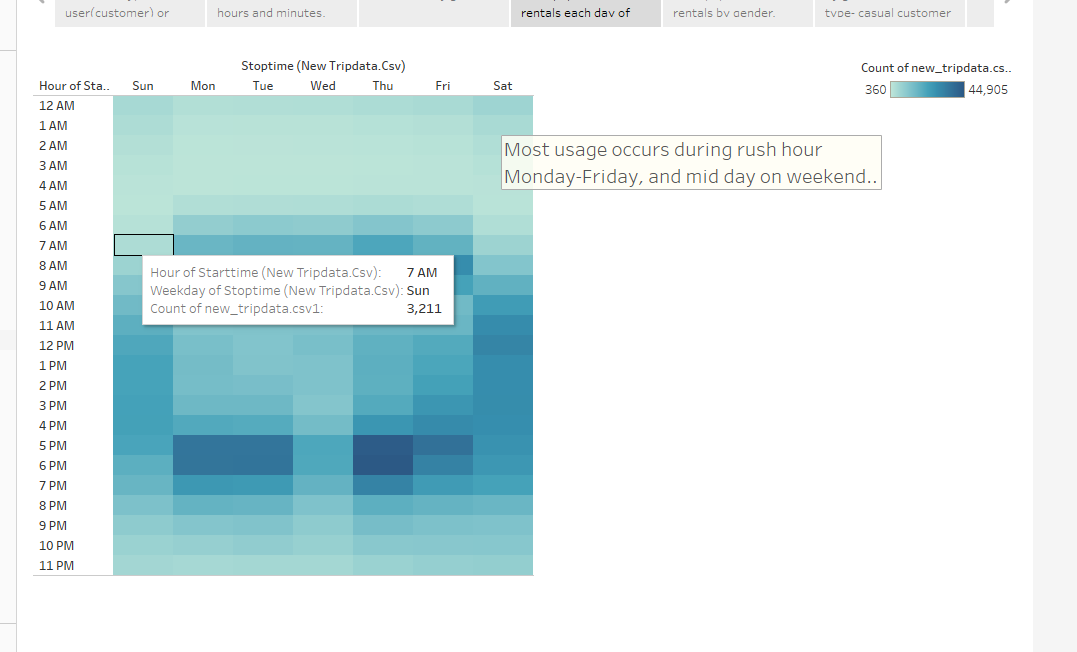
This visualization shows the usage of bikes on a weekday by the hour that the usage began. The heatmap allows viewing the entire timeline for the data with emphasis on the higher usage times. The visualization shows that most usage occurs during rush hour times Monday through Friday and midday on the weekends.
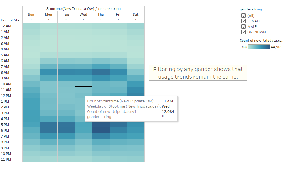
The visualization is also a heatmap as Trips by Weekday for Each Hour with the addition of gender as a filter. While all usage tends to focus on the time previously mentioned, it is important to note that females use the service more on weekends than males, and those listed as unknown gender use them predominantly on weekends.
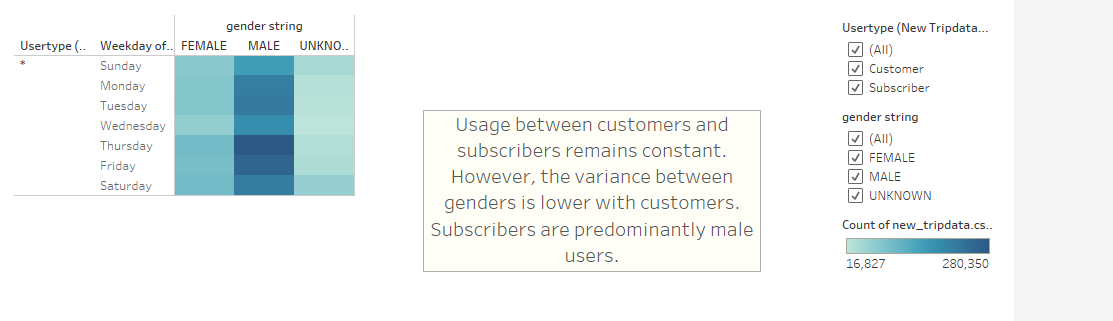
This visualization is also a heatmap, with the same information as Trips by Gender. This adds a new data point that differentiates between customers and subscribers while also allowing filtering by gender. The information in this chart shows that most subscribers are male, and their usage is mainly during the week. Females are mostly subscribers but have a higher percentage as customers than males. The data shows that most subscribers usage is during the week, and customers usage is on the weekends.
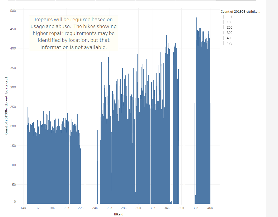
Knowing the frequency of required repairs is important to know the operating budget for this service. This visualization shows the frequency of use for each bike ID. Bikes with higher use will ultimately require more maintenance and repairs. This data can help plan if movement of bikes between stations is necessary to reduce or increase the usage of specific bike ID’s.
The data analysis visualizations show significant utilization of bikes in New York City. The visualizations specifically show information in easy to read and understand formats. The results are compelling to initiate a similar business in most cities. However, the data is lacking. The data is from a high-density city where a large portion of inhabitants do not own vehicles, or do not want to drive them often within the city. Biking can often be a quicker mode of transportation within high density cities. De Moines may not be represented in this fashion. An analysis of population density and car usage should be performed to indicate potential subscriber base, as subscribers will most likely make up most of the business.
With the provided data set, other visualizations could help with the ultimate decision to proceed, or not, a similar business in De Moines. There are two visualizations that need to be completed with the provided data.
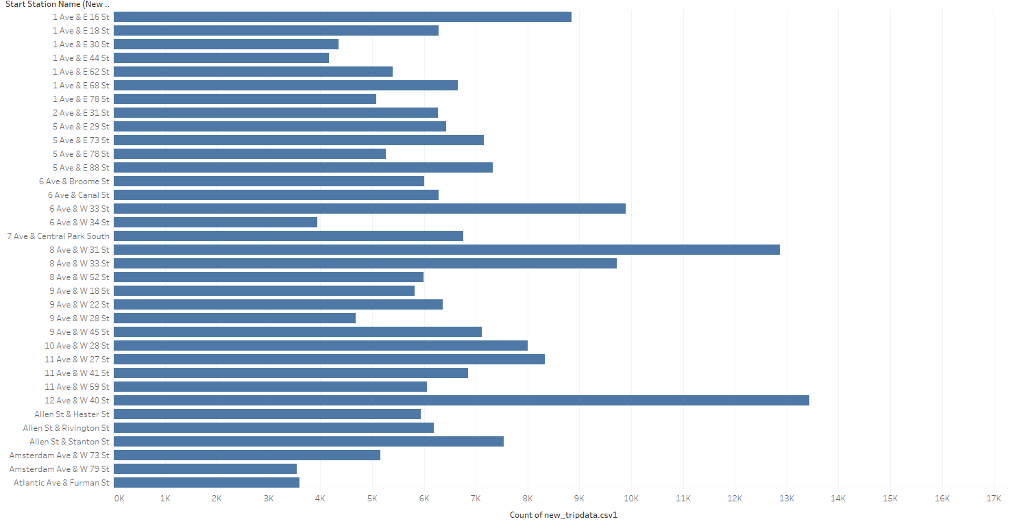
- The first should be usage by locations. This would help identify the high use areas for the service. Additional research could be done to identify what businesses, residence, and recreation may be around those areas to compare to similar areas in De Moines.
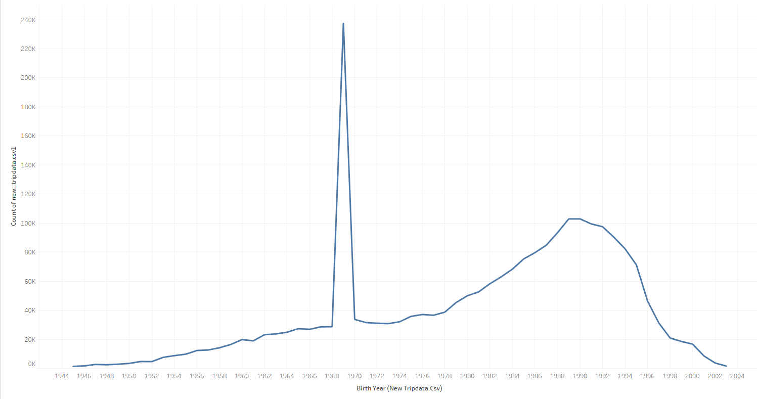
- The second visualization identify the approximate age of those using the service, both subscriber and customer. This information would identify which market could be targeted with advertising, and possibly which areas should gain focus for rental locations. This visualization indicates a possible error in the data for the date range between 1968 and 1970 that should be investigated. However, the remaining data is usefull.