
A Swift package for making buttons which animate on press, eliminating the need for tedious state management. Can easily replace the traditional SwiftUI Button, as it's declaration mirrors it almost exactly.
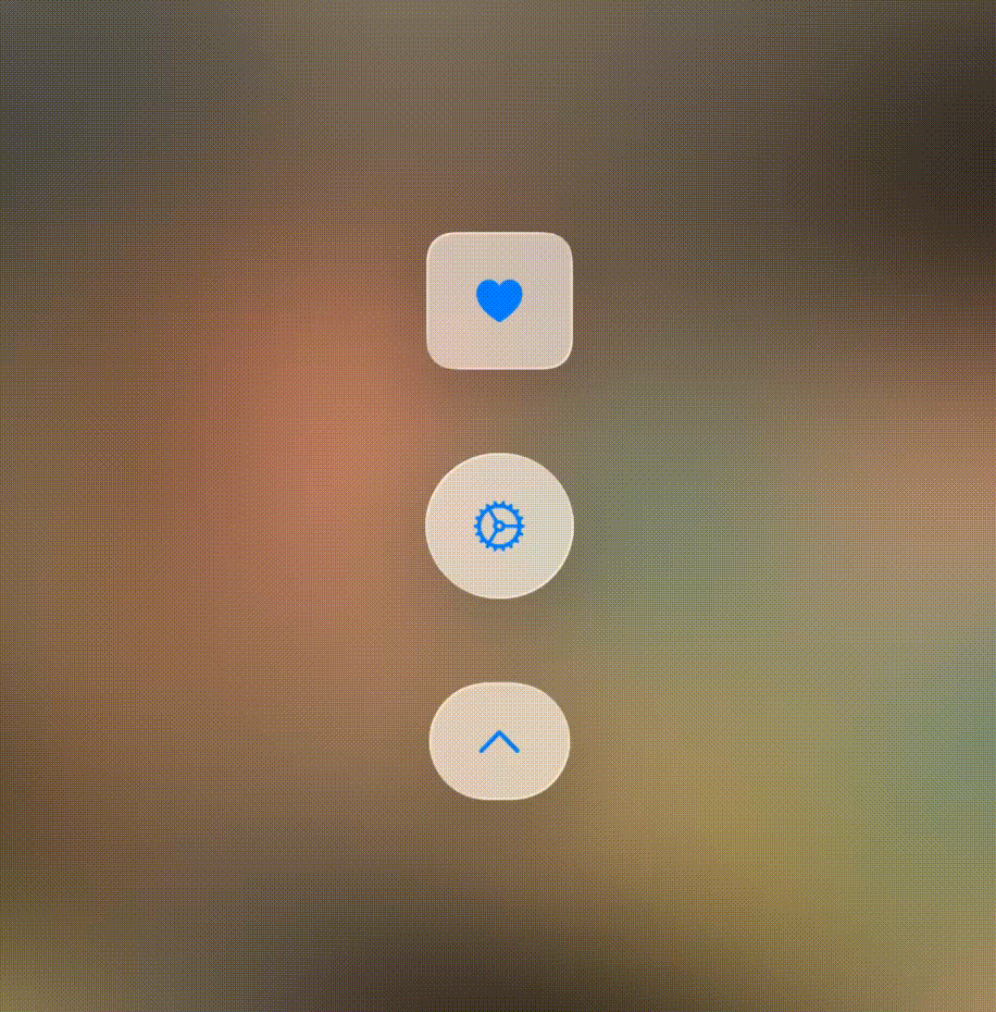
📎 Adds Animated Buttons which manages its own state without needing to be defined in the view.
🗃️ Includes a variety of customizable animation presets with parameters.
🖼️ Supports both SFSymbols or custom images.
📱 Intuitive integration with SwiftUI, mirroring the traditional Button declaration.
📌 iOS 14.0, 15.0, 16.0, 17.0, 18.0 +
🛠️ Swift 5.3+
AnimatedButtonKit is available via Swift Package Manager (SPM).
Using Swift Package Manager
🏗️ Open your Xcode project.
➕ Go to File → Add Packages.
🔗 Enter the repository URL:
https://github.com/LuckDuracell/AnimatedButtonKit
✅ Select the latest version and add it to your project.
AnimatedButton Declaration vs Button Declaration
import SwiftUI
import AnimatedButtonKit

struct ContentView: View {
    var body: some View {

        AnimatedButton(animation: .rotate, icon: "gear") {
            print("neat action!")
        } label: { icon in
            icon
                .padding(5)
                .background(.regularMaterial)
                .font(.title)
        }

        Button {
            print("neat action!")
        } label: {
            Image(systemName: "gear")
                .padding(5)
                .background(.regularMaterial)
                .font(.title)
        }
    }
}
Custom Icon rather than SFSymbol
import SwiftUI
import AnimatedButtonKit

struct ContentView: View {
    var body: some View {

        AnimatedButton(animation: .rotate, image: Image(.yourIconHere)) {
            print("neat action!")
        } label: { icon in
            icon
                .resizeable()
                .scaledToFit()
                .frame(width: 30, height: 30)
                .background(.regularMaterial)
        }

        Button {
            print("neat action!")
        } label: {
            Image(.yourIconHere)
                .resizeable()
                .scaledToFit()
                .frame(width: 30, height: 30)
                .background(.regularMaterial)
        }
    }
}
| 🗃️ Preset | 🔢 Value | 🗂️ Parameters |
|---|---|---|
| .rotate | Rotates 360 degrees on button press | No parameters needed! |
| .flip | Rotates 180 degrees on button press | No parameters needed! |
| .bounce | Bounces the passed Y amount then back | _ amount = -5: The distance to slide up/down before sliding back to offset of zero |
| .slide | Slides the passed X amount then back | _ amount = 5: The distance to slide left/right before sliding back to offset of zero |
| .squish | Compresses the shape vertically by the passed proportion from 0 to 1 | _ amount = 0.2: The proportion (some value from 0 to 1) that the shape gets vertically compressed before returning to original size. _ makeWider = false: Determines whether or not the shape should get to sell the visual that the icon is being squished by allowing it to briefly increase in width |