



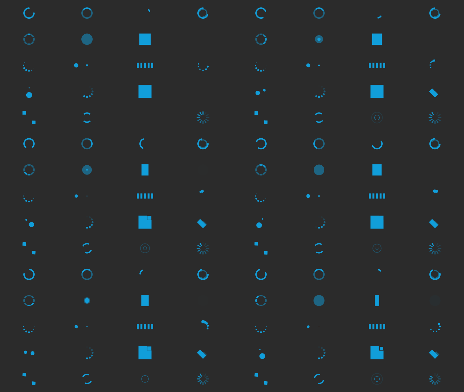
LoadingIndicators.Avalonia is an adaptation for Avalonia of the LoadingIndicators.WPF collection of animated loading indicators. It provides 20 ready-to-use animated spinner styles as a single LoadingIndicator control.
dotnet add package LoadingIndicators.Avalonia.NewRequirements: .NET Standard 2.0 or later (Avalonia 11.x), or .NET 8.0 or later (Avalonia 12.x+).
- 20 Built-in Animation Styles: Choose from Arc, ArcEase, ArcGrow, Arcs, ArcsRing, Bounce, Plane, Pulse, Circle, Flow, Wave, Chase, CircleFade, Swing, Grid, Fold, Wander, DualRing, Ripple, and Spinner.
- Easy Activation: Toggle the indicator on and off with the
IsActiveproperty. - Adjustable Speed: Control animation speed independently of other UI elements via
SpeedRatio. - Theme-Aware Color: Animation color defaults to the application's Fluent accent color automatically; override per-instance with the
Foregroundproperty. - Customisable Stroke: Adjust line thickness for arc-based styles with the
Thicknessproperty. - Cross-Platform: Runs on all platforms supported by Avalonia (Windows, macOS, Linux, Browser, Mobile).
- Compiled Bindings: Uses Avalonia compiled bindings by default for improved performance.
Add the styles to App.axaml so all LoadingIndicator controls in your application can resolve their themes:
<Application.Styles>
    <FluentTheme />
    <StyleInclude Source="avares://LoadingIndicators.Avalonia/LoadingIndicators.axaml" />
</Application.Styles>Place a LoadingIndicator in any view and bind IsActive to your view-model's busy flag:
<LoadingIndicator IsActive="{Binding IsBusy}" Mode="Arcs" />Optionally adjust speed, thickness, or override the color:
<LoadingIndicator IsActive="{Binding IsBusy}" Mode="Arc" SpeedRatio="1.0" Thickness="6" />
<LoadingIndicator Mode="ArcGrow" Foreground="CornflowerBlue" />| Property | Type | Default | Description |
|---|---|---|---|
IsActive |
bool |
true |
Shows or hides the animation |
Mode |
LoadingIndicatorMode |
Arc |
Selects the animation style |
SpeedRatio |
double |
1.0 |
Multiplier for the animation speed (1.0 = normal speed) |
Thickness |
double |
4 |
Stroke thickness used by arc-based animation styles |
Foreground |
IBrush |
accent color | Animation color; defaults to the FluentTheme accent color |
| Mode | Description |
|---|---|
Arc |
A single 270° arc that spins continuously |
ArcEase |
A short quarter-arc spinning around a faint full-circle track with cubic ease-in-out easing |
ArcGrow |
Two concentric arcs where the outer rotates fully and the inner oscillates, varying the gap |
Arcs |
Two concentric arcs counter-rotating at different speeds |
ArcsRing |
Short arc segments arranged in a ring that flash bright in sequence with staggered delays |
Bounce |
Two overlapping circles that alternately grow and shrink with a half-cycle offset |
Plane |
A rectangle that alternately collapses vertically then horizontally, simulating a plane flip |
Pulse |
A filled circle that expands from nothing while fading out, creating a soft pulse effect |
Circle |
Small dots arranged in a circle that pulse in and out in sequence |
Flow |
Three dots that sequentially pop in and out with staggered delays |
Wave |
Five vertical bars that scale up and down in a rolling wave pattern |
Chase |
Six dots orbit in a ring while shrinking and growing in a staggered chase pattern |
CircleFade |
Twelve dots arranged in a ring that fade in sequence around the circle |
Swing |
Two opposite dots rotate around the center while growing and shrinking out of phase |
Grid |
Nine squares collapse and restore in a diagonal wave across a 3x3 grid |
Fold |
Four square faces fold in sequence around a central diamond silhouette |
Wander |
Two squares wander around a square path while rotating and shrinking at alternating corners |
DualRing |
Two opposing ring segments rotate continuously around the center |
Ripple |
Two stroked rings expand from the center in a half-cycle stagger while fading away |
Spinner |
Twelve radial bars form a rotating spinner with a linear trailing fade gradient |