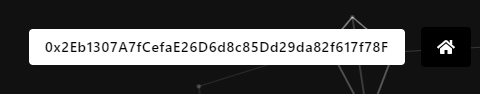
Current behavior
Currently our logo (white, top-left in screen) is only shown on wide screens as our responsive design scales the image down until it is invisible.
Desktop view:

Mobile view:
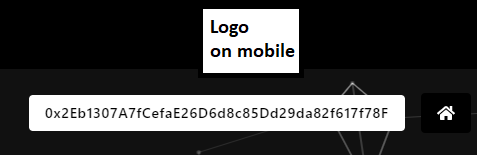
Desired behavior
Rather than hiding the image on small screens, we would like to center the logo on top of the navigation bar.
NOTE: On desktop devices the logo should be still shown on the top-left screen in the same row as it is right now.
Please pick a not too large image size for the logo to keep the mobile screen free.
Example on mobile screen:
The desktop view should still look like this:
Current behavior
Currently our logo (white, top-left in screen) is only shown on wide screens as our responsive design scales the image down until it is invisible.
Desktop view:

Mobile view:

Desired behavior
Rather than hiding the image on small screens, we would like to center the logo on top of the navigation bar.
NOTE: On desktop devices the logo should be still shown on the top-left screen in the same row as it is right now.
Please pick a not too large image size for the logo to keep the mobile screen free.
Example on mobile screen:

The desktop view should still look like this:
