Dear Ben, considering a distribution with a rather large number of cases at either end of a scale is something of a visualization challenge. Typically this is the case with a bounded [0,1] scale, like my example with ects scores of first year students [0,60] , that we discussed before:
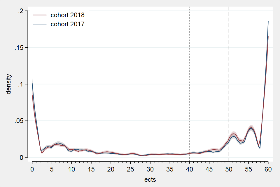
My interest is in being able to compare the distributions between the lower an upper bound but also to be able to see that there are such 'heaps' of data at the bounds. Regular Stata graphs will not facilitate that a section of the yaxis is removed in such way that we have a bottom part, say between 0 and .05 on the density axis (y), then a small intersection between parts and continue with the top part from .06 up to .2. With a lot of code wrangling it is possible to create two graphs and combine them but the result is not so attractive.
So, why not use your coefplot and addplot, using result data from dstat, to get such a plot? Is it possible? Yes, it is and here is my result:
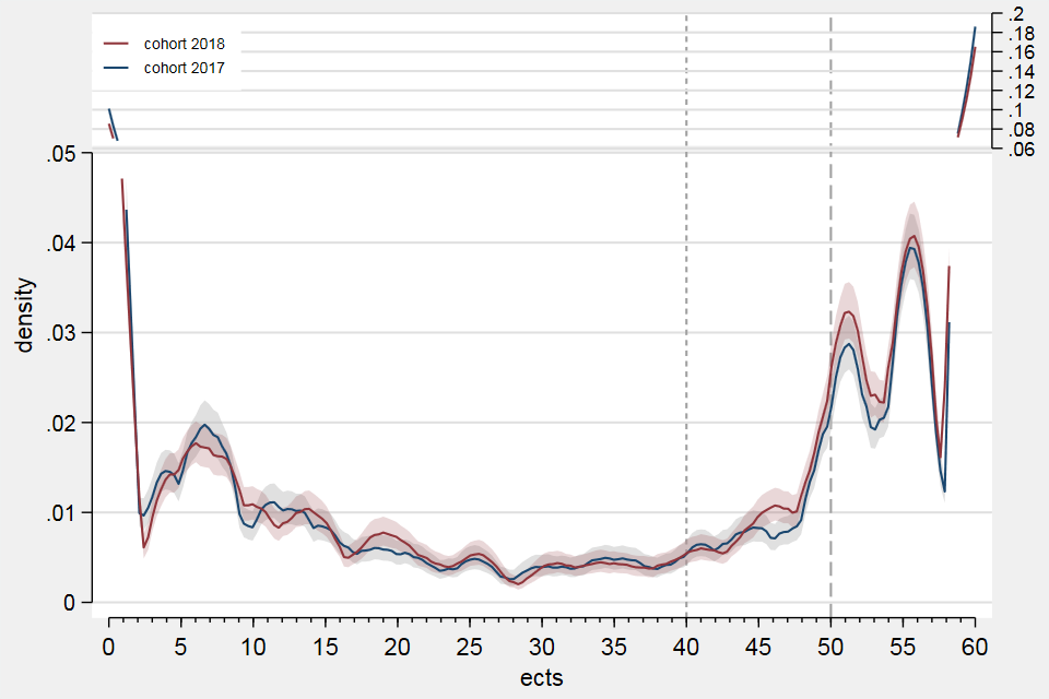
Note that I have located the y-axis of the top part to the right side to make it visually more clear that the density scale has been compressed although the ticks and labels have the same step size as the bottom part. Now there is vertically more room available to visualize the distributions between 1 and 59 ects. Note that the differences in the section between 40 and 50 ects are now more easy to inspect (which are of substantive interest for hypothesis development etc.).
I am not going to show you here all the 250 lines of code that are required to create this plot. Most of it is forced upon me as I have to move data around abundently and I expect that much of it can be replaced by more simple coding. Moreover, I have to admit that I first had to tweak your dstat.ado file in the section // draw graph from line 1429 with:
	frame create dstat3	// 20221213 EM
	frame create dstat4
	frame create dstat5
	mat M3 = __000003'
	mat M4 = __000004'
	mat M5 = __000005'
	frame dstat3: svmat2 M3, names(col) rnames(labX)
	frame dstat4: svmat2 M4, names(col) rnames(labX)
	frame dstat5: svmat2 M5, names(col) rnames(labX)
I apologize for my intrusion into your code, but, what this does is to store the three utility matrices __000003, __000004 and __000005 that are used by dstat to draw the result plot using coefplot into the data frames dstat3, dstat4 and dstat5.
There was no other way for me to get access to dstat's internal matrices and use them to create the (same) matrices for the bottom part of the above plot while I also save result data (edited) in variables (of yet another data frame) to create the top part using addplot. I suppose this procedure will still be a challenge for most Stata users but it is proof that it is possible to overlay two plot sections using the same x-axis and y-scale (but with two y-axes) on a single plot using your coefplot and addplot (and be able to replicate the result).
I suppose that this use of dstat, coefplot and addplot is not so much a regular requirement. But, I do think that it will be a very useful addition to the box-of-tools to create convincing statistical plots of data relevant for exploration and analysis.
So, here is my request Ben, could you add a result matrix to dstat that has the data of the three utility matrices __000003, __000004 and __000005 that are used by dstat to draw the result plot using coefplot?
Ofcourse, I only write about my own example and I assume that it is possible that dstat might use more utility matrices to create a graph but all of them might have the same matrix format. I am interested to read if you think that it is possible to include such a result matrix, possibly called something like e(plot).
In any case, I think it could be an opportunity to write a brief paper about this subject for The Stata Journal (possibly together if you are interested(?)).
Dear Ben, considering a distribution with a rather large number of cases at either end of a scale is something of a visualization challenge. Typically this is the case with a bounded [0,1] scale, like my example with ects scores of first year students [0,60] , that we discussed before:


My interest is in being able to compare the distributions between the lower an upper bound but also to be able to see that there are such 'heaps' of data at the bounds. Regular Stata graphs will not facilitate that a section of the yaxis is removed in such way that we have a bottom part, say between 0 and .05 on the density axis (y), then a small intersection between parts and continue with the top part from .06 up to .2. With a lot of code wrangling it is possible to create two graphs and
combinethem but the result is not so attractive.So, why not use your
coefplotandaddplot, using result data fromdstat, to get such a plot? Is it possible? Yes, it is and here is my result:Note that I have located the y-axis of the top part to the right side to make it visually more clear that the density scale has been compressed although the ticks and labels have the same step size as the bottom part. Now there is vertically more room available to visualize the distributions between 1 and 59 ects. Note that the differences in the section between 40 and 50 ects are now more easy to inspect (which are of substantive interest for hypothesis development etc.).
I am not going to show you here all the 250 lines of code that are required to create this plot. Most of it is forced upon me as I have to move data around abundently and I expect that much of it can be replaced by more simple coding. Moreover, I have to admit that I first had to tweak your
dstat.adofile in the section// draw graphfrom line1429with:I apologize for my intrusion into your code, but, what this does is to store the three utility matrices
__000003,__000004and__000005that are used bydstatto draw the result plot usingcoefplotinto the data framesdstat3,dstat4anddstat5.There was no other way for me to get access to dstat's internal matrices and use them to create the (same) matrices for the bottom part of the above plot while I also save result data (edited) in variables (of yet another data frame) to create the top part using
addplot. I suppose this procedure will still be a challenge for most Stata users but it is proof that it is possible to overlay two plot sections using the same x-axis and y-scale (but with two y-axes) on a single plot using yourcoefplotandaddplot(and be able to replicate the result).I suppose that this use of
dstat,coefplotandaddplotis not so much a regular requirement. But, I do think that it will be a very useful addition to the box-of-tools to create convincing statistical plots of data relevant for exploration and analysis.So, here is my request Ben, could you add a result matrix to
dstatthat has the data of the three utility matrices__000003,__000004and__000005that are used bydstatto draw the result plot usingcoefplot?Ofcourse, I only write about my own example and I assume that it is possible that
dstatmight use more utility matrices to create a graph but all of them might have the same matrix format. I am interested to read if you think that it is possible to include such a result matrix, possibly called something likee(plot).In any case, I think it could be an opportunity to write a brief paper about this subject for The Stata Journal (possibly together if you are interested(?)).